As highly skilled‚ boutique builders of up-market homes‚ L. K. Yates Constructions Pty Ltd also enjoyed a history of building great relationships with their clients and their clients’ architects. Their brand identity‚ however‚ was ripe for renovation. HarrisonNess was happy to oblige. To reflect their caring personality‚ as evidenced by the glowing endorsements of their clients‚ and to convey their unassuming professionalism‚ we repositioned the brand simply as: Yates – Dream Builders.
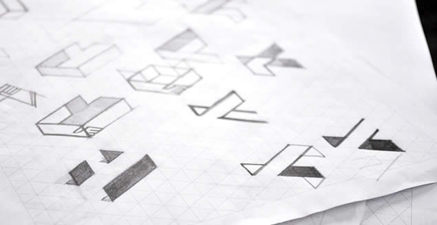
Our branding solution addresses the perception that building can be a nightmare‚ and highlights the ‘dream run’ clients can justifiably look forward to with Yates Builders. The new logo incorporates a mark forming the letter ‘Y’ from three free-standing ‘walls’. The fresh and uncomplicated visual identity has been applied to stationery and collateral material‚ vehicle and building-site signage‚ outdoor advertising and digital direct marketing material. The Yates Builders website breaks new ground for the category in terms of its simplicity‚ and features a navigation device that makes the website fun to explore.
